Logo Animation | Paynless Properties
I worked with the talented graphic designer, Jonny Georgeson, to bring motion and life to the Paynless Properties logo.
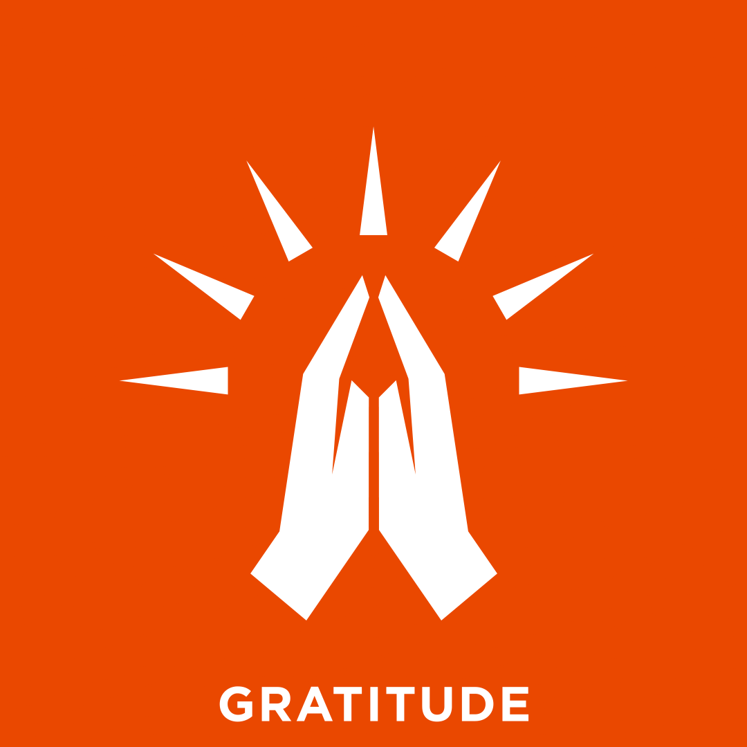
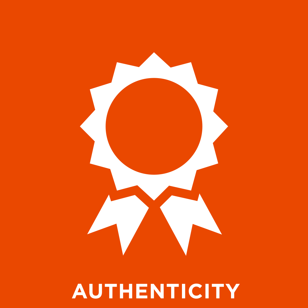
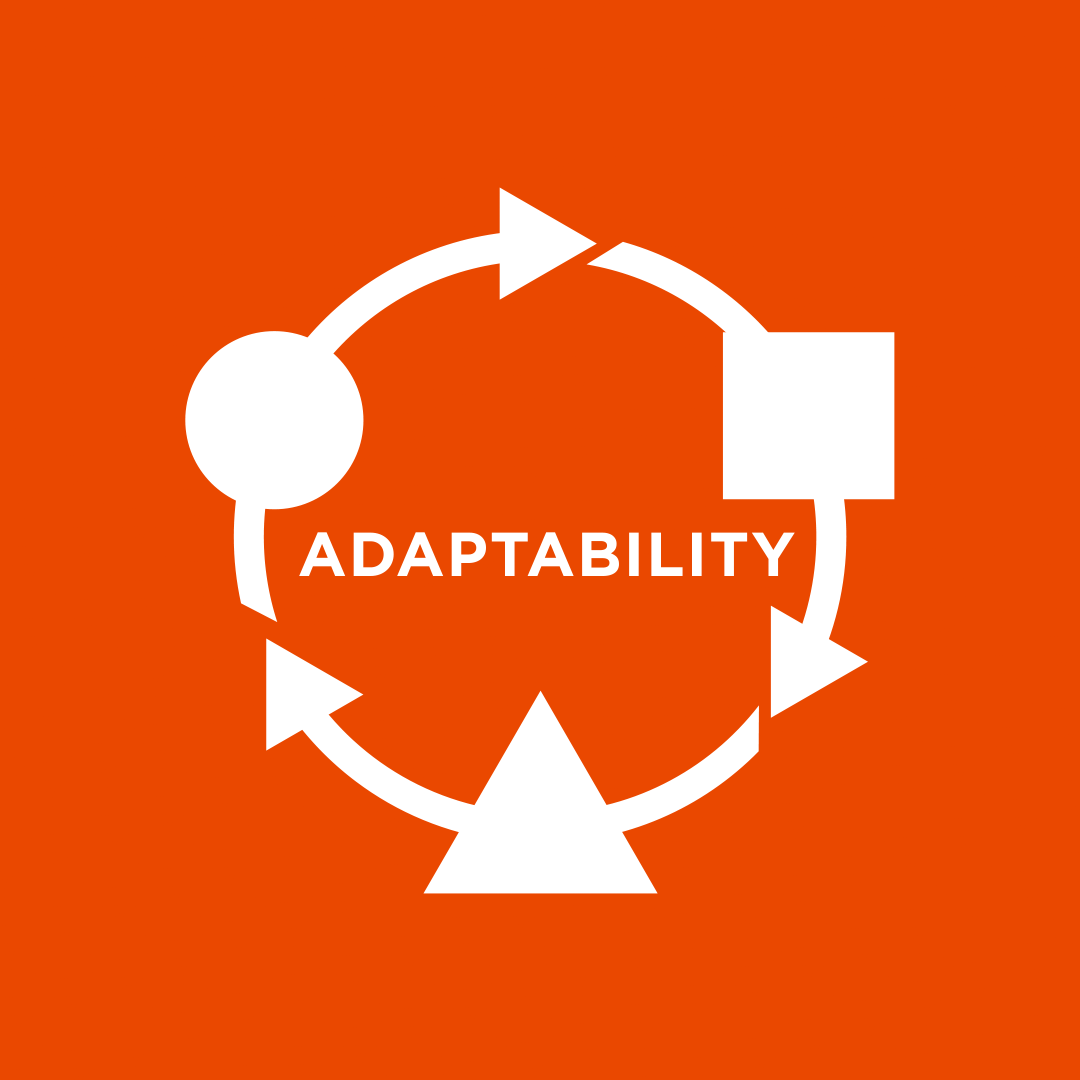
Not only was the client interested in adding dynamism to their logo, but they wanted to include graphics and text that would highlight key values of their organization: Results, Gratitude, Authenticity, and Adaptability.
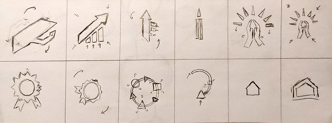
My challenge was to include those images with the logo in a way that felt natural to the eye, and created a strong sense of continuity and unity. I wanted each value to feel connected to the others.


Through storyboarding I was able to design smooth and natural transitions between the various shapes which created that sense of continuity.

I faced an additional challenge in that they client hadn’t decided on the final logo. While most of the animation remained unchanged, I was tasked to create separate animations between the house graphic, each logo, and the results graphic. With some input from Jonny, and several tests I was able to create two separate animations that both felt continuous and satisfying.


Ultimately, and after a little tweaking, I was able to deliver a logo animation that the client loved, and that captured their company values.
